RACV
Bringing to life an effective, sustainable experience language
The Challenge
The goal of this project was to support the growth of RACV and set their team up to deliver exceptional member experiences at scale, improving efficiency and alignment to allow the team to focus on creating value to their members.
The RACV digital presence had become very difficult to manage and the design system was a chance for us to establish clear standards, principles and processes that could build a sustainable experience language which would empower the team.
What was quite a unique project for the agency meant we were designing for an audience of designers, developers and members of the experience team, helping them realise the value of the system and support them being successful producing experiences across the ecosystem currently as well as in the future. It was an opportunity to take holistic view of the ecosystem which isn't usually practical or possible during regular projects.
Design Process
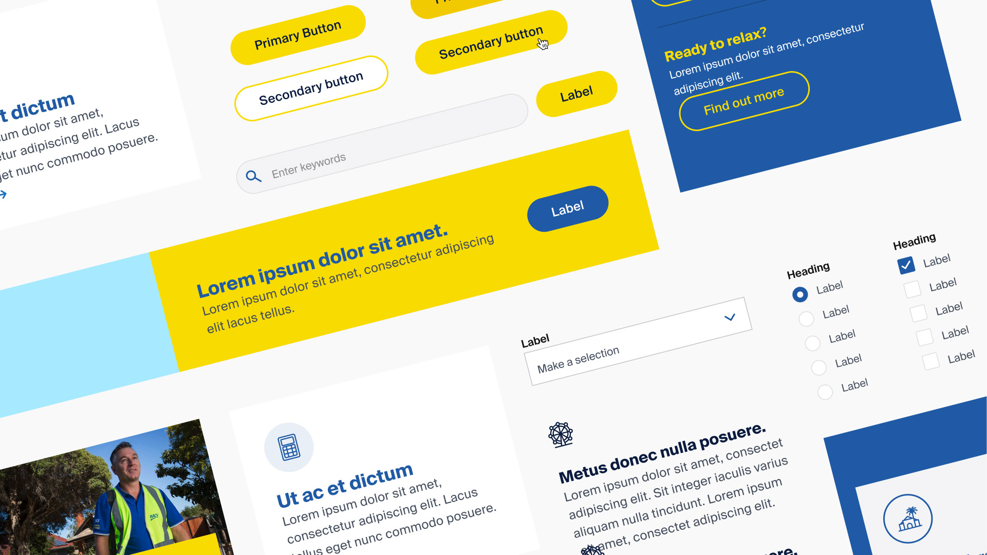
To understand how to create the right type of design system for the RACV teams specific needs, we complex both a complex resource and visual audit. This included 28 experience templates, 28 example pages, 7 categories, 86 components, 20 component variations, 70 unique product pages and 15 additional form components, supported by detailed analysis on the relationships between key components and templates and technical interviews done by other members of the team to understand constraints and pain points for the developers and content authors.
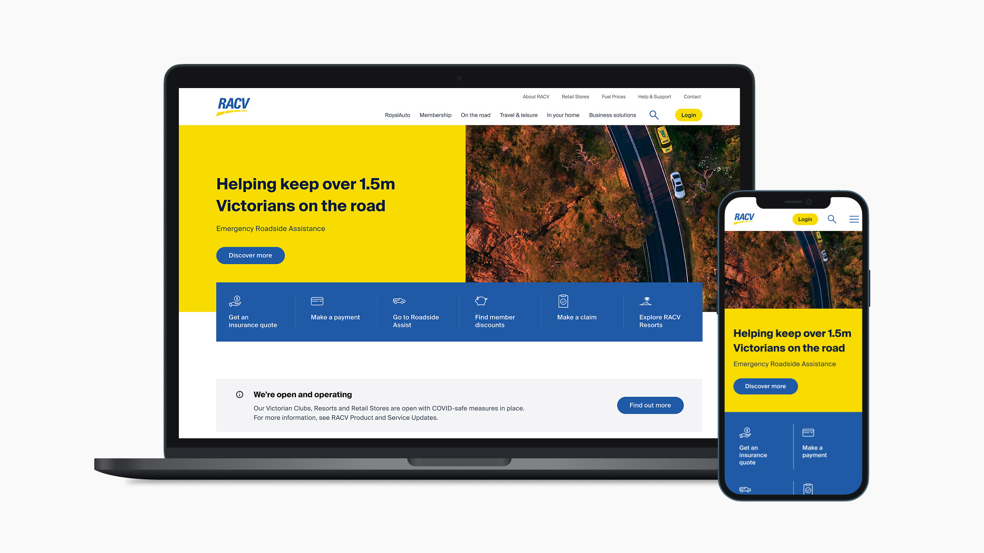
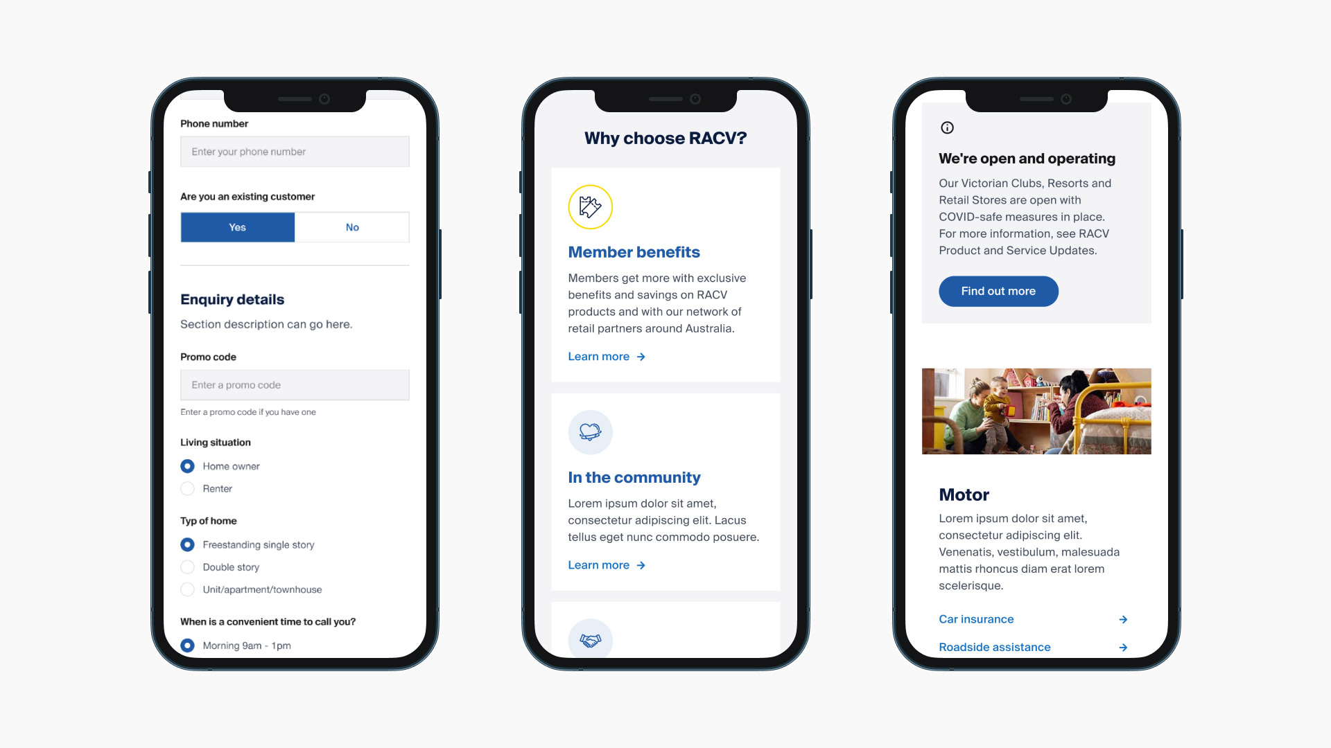
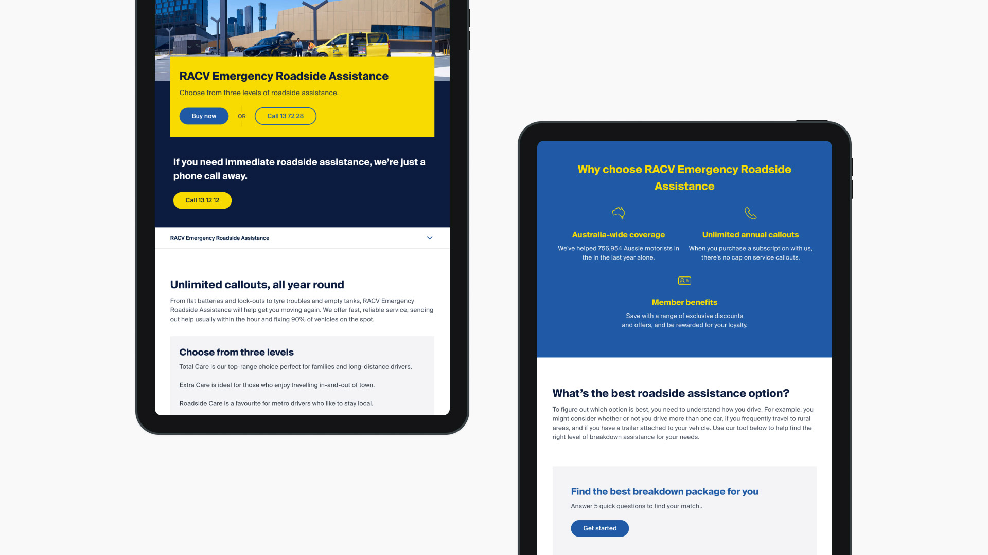
We wanted to move the digital brand aesthetic closer towards the offline brand work and establish theory to elevate the brand colours. Another area of improvement was around improving accessibility including colour contrast and messaging. There was a lack of strong type heirarchy, by adding more prominence around headlines and section headings there would be greater usability. Moving away from full width text blocks was another decisions to add better readability and accessibility.
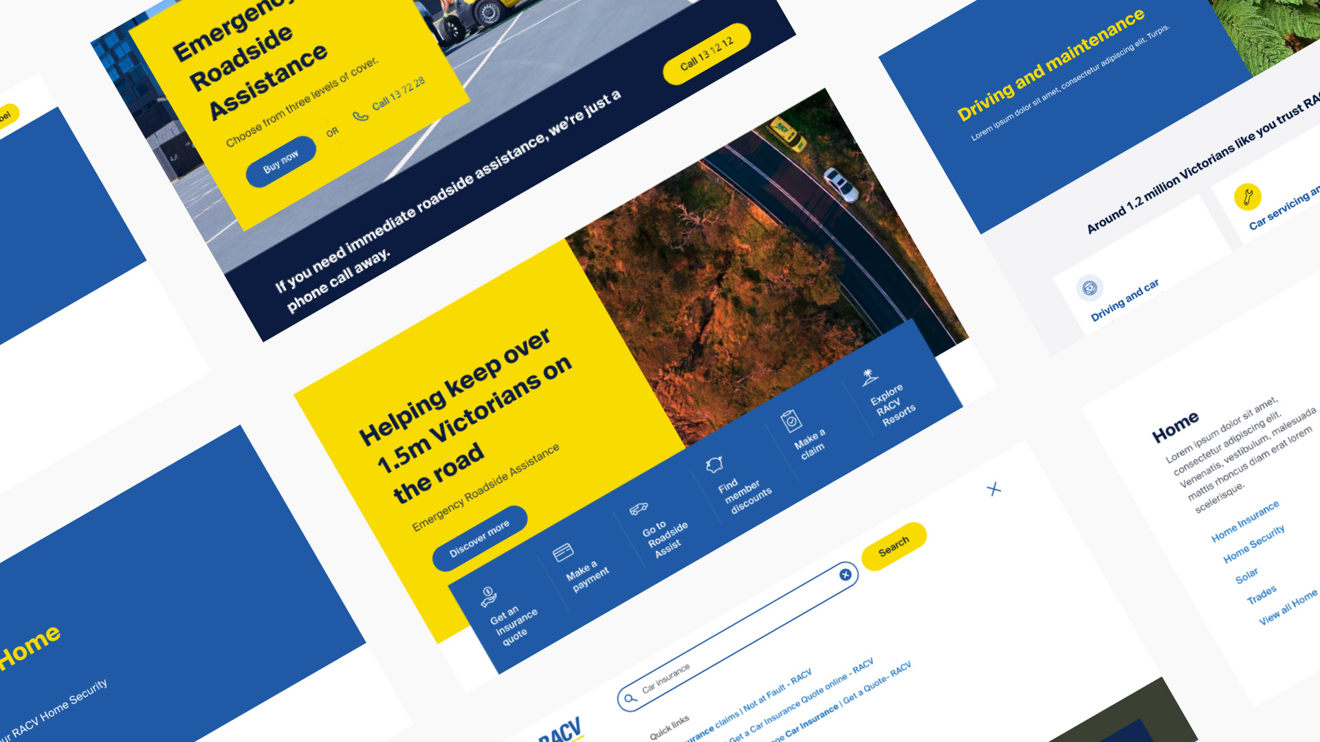
Generic use of common components for many different uses led to challenging, complex variations that suffered from lack of purpose and usability challenges. When redesigning the components for the new design system we rethought the purpose behind each component, where to add new components and how to introduce variants for better usability. Boxy aesthetic interrupted the page structure and made content hard to access without clearly defined sections. By learning developer implications we created more refined and consistent layouts for templates and spacing within components so that designs would balance flexibility and structure going forward.
There was a lot of work to define the semantic structure and roles of icons on the site. We separated interface and product icons while also adding variants for different use cases of our illustrative icon style.
Design tooling
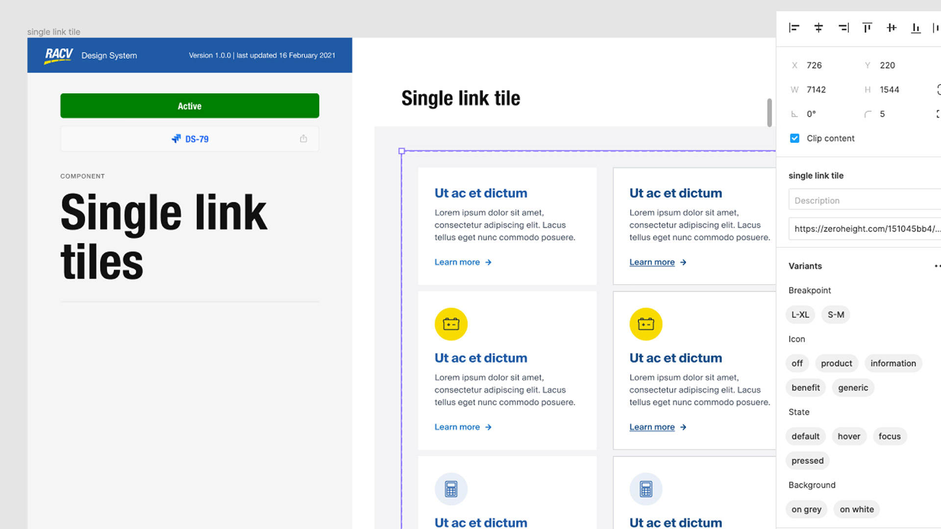
We moved to Figma as the primary design tool to solve key challenges of team collaboration, alignment and to provide and infrastructure for an effective system. We set up both a legacy and future state design system as well as setting up the project structure for the team to build out their design libraries and current work.
The design system project was a great opportunity to deep dive into the exciting new features within Figma, and by utilising component variants and auto layout we were able to produce design artefacts that were extremely robust, accurately and functionally responsive and allowed us to create a library of every page template for all our breakpoints within a small amount of time.
Zeroheight was our documentation tool that brought the system together and synced our code and design instances. We had a philosophy to never duplicate content and always refer to a Zeroheight instance. The hard work was to balance offering enough guidance and documentation without becoming cumbersome for a team member to understand a component.
We introduced a template to make sure component guidelines were consistent and easy to follow as well as to create in the future, there was also extensive guidelines for onboarding team members, commentary around naming conventions and processes, and a ways of working document for introducing new designers.